
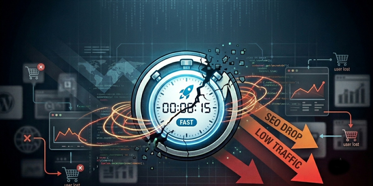
You spent weeks optimizing your server response times. You minified your JavaScript, compressed your images, and finally achieved that elusive green 90+ score on Google PageSpeed Insights. Your website is, by all technical definitions, fast.
But there’s a problem: your sales aren’t moving, your contact form is dead quiet, and your analytics show users are still leaving almost as quickly as they arrive.
It’s a frustrating reality that many business owners face. Speed is a critical foundation for a successful website, but speed alone doesn’t close deals. If your fast website is still losing customers, it usually comes down to a disconnect between technical performance and human behavior.
Here is why your lightning-fast site might be stalling, and exactly how to fix it.
1. You Optimized for Robots, But Forgot the Humans
Google’s search crawlers care about server response times and Cumulative Layout Shift. Humans care about finding answers to their problems within three seconds of landing on your page.
If a user clicks onto your site and is immediately met with a wall of dense text, cryptic navigation, or vague marketing speak (“We leverage synergistic paradigms to disrupt the market”), they will hit the back button. Your site loaded instantly, but because the clarity wasn’t there, you still lost the user.
The Fix: Evaluate your “above-the-fold” content—the very first thing a user sees before scrolling. Within three seconds, a visitor must know:
What you do.
How it solves their specific problem.
What action they need to take next (your Call to Action).
2. The “Choice Paralysis” Trap
When a website loads incredibly fast, users tend to browse with momentum. However, if your homepage is crowded with ten different offers, sidebars, pop-ups, and a massive 20-item navigation menu, that momentum grinds to a halt.
When humans are overwhelmed with choices, they usually choose nothing. A fast site that lacks a clear, singular path forces the user to do cognitive heavy lifting. If it’s too much work to figure out how to buy from you, they will find a competitor who makes it easier.
[ Crowded Layout: 3 Sidebars + Popups + 10 Offers ]  --> User Confusion --> Exit
[ Streamlined Layout: Single Path + Clear Action ]  --> Focused User   --> Conversion
The Fix: Ruthlessly simplify. Decide on the one main action you want a visitor to take on your homepage (e.g., “Book a Consultation” or “View the Portfolio”) and design the entire page layout to guide them toward that single goal.
3. Broken Visual Hierarchy (The Two-Column Tangle)
Good web design is invisible; it subtly guides the human eye exactly where it needs to go. Poor visual hierarchy is a massive conversion killer on fast sites.
A common example of this is the misuse of two-column layouts. When you split a section into two equal halves—say, a block of text on the left and an image on the right—without a clear focal point, the user’s eye doesn’t know where to land first. If your headlines, subheadings, and buttons all have similar visual weight, nothing stands out.
The Fix: Use contrast, size, and whitespace to build a deliberate path for the eyes.
Make your primary headlines bold and large.
Use high-contrast colors only for your action buttons.
If you use a two-column section, ensure one side is clearly dominant (e.g., a strong headline on the left, with a supporting, non-distracting graphic on the right) to create a natural left-to-right reading flow.
4. Friction in the Final Yards
Let’s say your fast site successfully hooks a visitor. They understand what you do, they like your style, and they click your “Contact Us” button. The page loads instantly.
Then, they see the form: First Name, Last Name, Email, Phone Number, Company Size, Budget, How Did You Hear About Us, and a 500-word Message Box.
Every single field you add to a form introduces friction. You might have a 100% optimized WordPress setup, but if your checkout process or contact form feels like a tax audit, users will abandon ship right at the finish line.
The Fix: Audit your conversion points. Strip your contact forms down to the bare minimum required to initiate a conversation (usually just a name, email, and a brief note). If you run an e-commerce platform, implement one-click checkout options. Smooth out the visual wrinkles so taking action feels effortless.
The Bottom Line
Speed gets users to the front door, but User Experience (UX) and Strategy are what invite them inside, hand them a drink, and convince them to stay.
A truly high-performing website is a balancing act. It requires a developer’s eye for clean, lightweight code to satisfy search engine algorithms, combined with a designer’s understanding of human psychology to satisfy the actual people using it.
If your site is built on a fast foundation, you’ve already won half the battle. Now, look at your layout through the eyes of a brand-new customer, remove the visual clutter, and make the path to working with you entirely unmistakable.